Provost Ralph J. Hexter has introduced a new, online tool that brings together a wealth of important data on who we are and what we do in our academic and research missions, and how well we are doing.
The Provost’s Dashboard provides easy access to trend information about programs and research funding, and student and faculty demographics, such as number of degrees conferred, percentages of underrepresented minorities in the student body, student-faculty ratios and budgeted faculty positions.
The dashboard is accessible by anyone who has a UC Davis Kerberos log-in.
“It is meant to be a tool of use to everyone on campus, wherever there is a need for data to enable our work or inform our decisions,” said Hexter, who as provost and executive vice chancellor serves as the campus’s chief academic and chief operating officer.
The Provost’s Dashboard brings together data that the university has always had, much of it online but in different places, some of it available only by asking for it — provided you knew where to look, what to ask for and whom to ask.
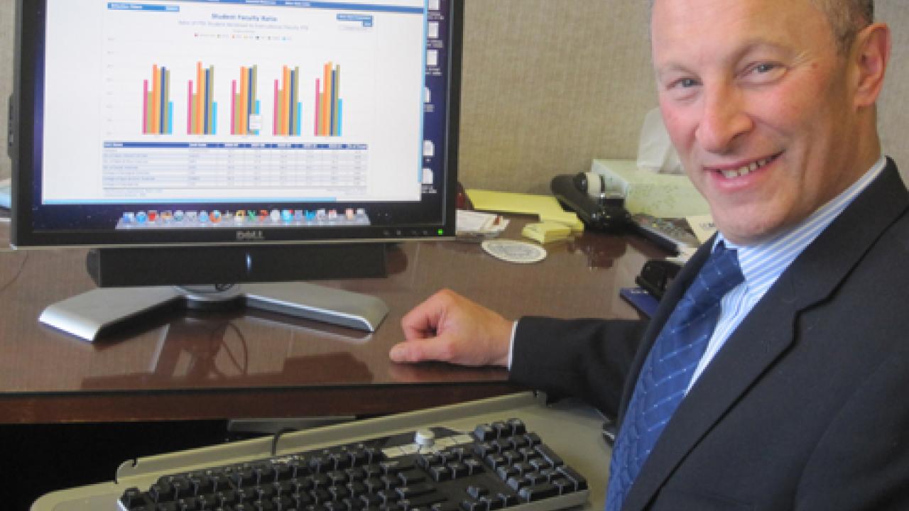
The dashboard works with drop-down menus, starting with three main categories: students, faculty and financial resources. Then, using more drop-down menus, you can refine your search, say, to the campus level, or to any of the colleges or schools, and, in many cases, down to majors and programs.
Click on what you are looking for, and a bar chart pops up with the corresponding numerical data underneath.
In addition, the dashboard provides instant comparison charts — allowing you to compare up to seven sets of data. For example, you can look at the university’s student-faculty ratio and compare it with the ratios in all six undergraduate colleges and divisions — each represented by a different-colored bar.
Previously, UC Davis had the data for such comparisons, but putting it together might not have been so simple. “We might have had to take one set of numbers for System A and another set from System B, and then put them together,” said Robert Loessberg-Zahl, director of Institutional Analysis, which built and maintains the dashboard.
Loessberg-Zahl’s unit — part of Budget and Institutional Analysis, a division of Administrative and Resource Management — comprises people who were already working with this kind of data in three other units: Student Affairs Research and Information, or SARI; Student Information System Decision Support; and Information and Educational Technology.
Loessberg-Zahl said merging these teams produced an incredible synergy, helped along by the office set-up: 14 individual work spaces in two rows, opposite each other, separated by a wide, carpeted corridor where people gather for all kinds of cross-cubicle collaboration.
“Hats off to this team,” said Loessberg-Zahl, commending not only the quality of their work but the speed at which they did it, in about a year.
Hexter said he particularly likes quick access via the dashboard to student success data, including:
• Persistence, or percentage enrolled after one year — 92.6 percent campuswide for the fall 2010 cohort.
• Freshman graduation rates — 51.4 percent campuswide for the students who enrolled in 2005 and graduated in 2009 (four-year rate), jumping to 81.6 percent for students who enrolled in 2005 and graduated in either 2010 or 2011 (six-year rate, accounting for students who did not enroll for a quarter or more).
• Time to degree (undergraduates) — A little more than four years campuswide for those who graduated in 2009-10 and who began their studies as freshmen.
“Among other things, it is hoped that the dashboard will ease analytical processes related to program review and program operations by offering important trend data at a single source in a common reporting format,” Loessberg-Zahl said.
In developing the dashboard, his unit worked in close partnership with the University Registrar, Student Financial Aid, Graduate Studies and the Office of Research, and in consultation with the assistant deans in the schools, colleges and divisions.
Institutional Analysis is now exploring partnerships with Capital Resource Management and the Office of Graduate Studies to add facilities assignment and usage data, and a richer variety of information about graduate programs and students.
Although the dashboard is an important step forward in making a wealth of information about academic programs available to the campus community, Hexter noted that the dashboard is a work in progress.
“We intend it to evolve as the needs of the campus evolve,” he said. “So a critically important aspect of its future development are ideas direct from the campus community about possible improvements and metrics to be added.”
For example, according to Loessberg-Zahl, someone recently inquired about STEM metrics, regarding students and programs in science, technology, engineering and mathematics — and this is data that will be added to the dashboard.
In his welcome note on the dashboard’s landing page, Hexter asks people to comments and suggestions by e-mail to bia-dashboard@ucdavis.edu.
Media Resources
Dave Jones, Dateline, 530-752-6556, dljones@ucdavis.edu